Friday, October 7, 2011

france bans fracking in shale gas development, netherlands gives permits

in an earlier post i wrote about shale gas protesting in france (protest song by my brother here).

this week the french government has banned the use of fracking in shale gas exploration/development.

this is extremely good news, and shows that protest can be effective.

sadly, at the same time my own government has given exploration permits to a number of companies to look for shale gas even in the area where i live. so i just signed a protest petition on www.gnmf.nl (in dutch). i hope that many people will sign, and protest in other ways as well.

Wednesday, September 7, 2011

mountain blaze

mountain blaze ~ frank waaldijk
mountain blaze (own work, 2010, 80 x 200 cm, click on the image for an enlargement)

this large painting is hard to photograph, i find, because it is difficult to avoid reflections of light and also because it is difficult to get the colours approximately right. still, the photo should help to explain the sense of adventure that i had while painting it. i did not know where i was going, i just painted very boldly, as if i knew what i was doing...

going from very bold strokes to finer brushes, but maintaining the `firesome' spirit of the mountain, was quite a challenge. like i said in previous posts: it feels like it isn't really me who is painting. i'm just holding the brush.

i really wonder where this landscape journey will take me in future years.

Tuesday, September 6, 2011

clouds over fallow field

clouds over fallow field ~ frank waaldijk
clouds over fallow field (own work, 2000-2010, 39 x 128 cm, click on the image for an enlargement)

this painting really took quite some time to finish. i worked on it (off and on) for 10 years. this is partly because i have to get used to a painting, especially when it contains something really new to me which i cannot place but which i feel is worthy of development.

lately, i have found new improvement in this process. it has become easier for me to discern in which direction i want to proceed, and which elements in a painting strengthen this direction and which elements weaken it. also, i find it easier to merge `old' work with new insights, for which i am grateful because i have a lot of `old' work which awaits finishing.

[postscript: i discovered that i already posted this painting, to illustrate an exhibition announcement. but it fits in the series of recent landscapes.]

Tuesday, August 30, 2011

sea, sky

sea, sky ~ frank waaldijk
sea, sky (own work, 2010, 120 x 122 cm, click on the image for an enlargement)

i would like to post some fairly recent landscapes, now that i've been freed from the mathematical project `natural topology' (see one-but-previous post). however, i just realized that images will be better findable on the web if i dedicate a post to each image separately.

this is more work, but it also gives opportunity to describe the paintings separately, which should be added benefit. i just have to overcome my usual reluctance to add words to a painting.

the above painting is characteristic of my continuing resolve to paint `as is'. i don't know why a painting works or not, i just know when it does. and i know that by allowing my subconscious intuition free rein, eventually a painting will start to work. even though this may be a laborious and time-consuming process.

i think that i'm in the process of reducing some aspects of landscapes to their essence. this is probably an inevitable development, and i'm looking forward to start a new painting. each time it surprises me how strongly paint can speak, even when reduced to simple forms and strokes.

stolen drawing (art theft 1)

man (stolen drawing), frank waaldijk
man (own work, 1985-2005, 40 x 60 cm (approx.), click on the image for an enlargement)

the above drawing (of which i have only a poor photograph, and which has been slightly altered since) was stolen from the corridor in my studio building, last june. by someone with a key, even, which makes it all the more painful. i have since removed my paitings and drawings from the corridor.

obviously someone thought the drawing beautiful enough to steal. but for me it is a unique work, which i created primarily in art school (art academy utrecht) and which i later retouched and slightly modified for more effect. it was not for sale, because it is a dear example of how i started out as an artist.

i cannot put into words how cowardly and callous i find this theft. perhaps i will write some more posts on art theft in general.

Sunday, July 31, 2011

Natural Topology (mathematics book announcement)

ocho infinito xxiii, frank waaldijk
ocho infinito xxiii (cover drawing for the book `Natural Topology', own work, 2004-2011, click on the image for an enlargement)

Dear readers, some of you may know that Wim Couwenberg and I started a project called `Natural topology' some years ago. The aim of the project is a) to explain intuitionism to classical mathematicians b) to simplify aspects of formal topology c) to show that intuitionistic topology is elegant and constructive, and its results can be easily translated to Bishop-style mathematics if one inductivizes the definitions d) to clarify in-our-eyes-important aspects of the relation between foundations of constructive mathematics and the foundations of physics.

Last January, we gave an informal talk about this project at the University of Nijmegen for a general audience. Positive and sceptical reactions together prompted me to work out the basic idea rigorously, all the time linking it to other developments. I am happy to announce that the long-promised book Natural Topology is now available online, from my website at http://www.fwaaldijk.nl/natural-topology.pdf

An abstract of the book is given below. I hope it will provide food for thought and discussion, also for the philosophy of mathematics and physics. The book is essentially self-contained and on the advanced undergraduate level (I believe), meaning that anyone with a knowledge of basic topology and some perseverance should be able to read it. For a good appreciation of the whole book, a certain knowledge of constructive mathematics probably is necessary, I suspect. But enough interesting elements should be accessible to anyone, I hope. (An interesting general-audience example concerns the line-calling decision-support system Hawk-Eye used in professional tennis.)

Of course all comments and reactions are welcome.

Kind regards,
Frank Waaldijk
http://www.fwaaldijk.nl/mathematics.html


Abstract:

We develop a simple framework called `natural topology', which can serve as a theoretical and applicable basis for dealing with real-world phenomena. Natural topology is tailored to make pointwise and pointfree notions go together naturally. As a constructive theory in BISH, it gives a classical mathematician a faithful idea of important concepts and results in intuitionism.

Natural topology is well-suited for practical and computational purposes. We give several examples relevant for applied mathematics, such as the decision-support system Hawk-Eye, and various real-number representations.

We compare classical mathematics (CLASS), intuitionism (INT), recursive mathematics (RUSS), Bishop-style mathematics (BISH), formal topology and applied mathematics, aiming to reduce the mutual differences to their essence. To do so, our mathematical foundation must be precise and simple. There are links with physics, regarding the topological character of our physical universe.

Any natural space is isomorphic to a quotient space of Baire space, which therefore is universal. We develop an elegant and concise `genetic induction' scheme, and prove its equivalence on natural spaces to a formal-topological induction style. The inductive Heine-Borel property holds for `compact' or `fanlike' natural subspaces, including the real interval [α,β]. Inductive morphisms preserve this Heine-Borel property. This partly solves the continuous-function problem for BISH, yet pointwise problems persist in the absence of Brouwer's Thesis.

By inductivizing the definitions, a direct correspondence with INT is obtained which allows for a translation of many intuitionistic results into BISH. We thus prove a constructive star-finitary metrization theorem which parallels the classical metrization theorem for strongly paracompact spaces. We also obtain non-metrizable Silva spaces, in infinite-dimensional topology. Natural topology gives a solid basis, we think, for further constructive study of topological lattice theory, algebraic topology and infinite-dimensional topology.

The final section reconsiders the question of which mathematics to choose for physics. Compactness issues also play a role here, since the question `can Nature produce a non-recursive sequence?' finds a negative answer in CTphys. CTphys, if true, would seem at first glance to point to RUSS as the mathematics of choice for physics. To discuss this issue, we wax more philosophical. We also present a simple model of INT in RUSS, in the two-player game LIfE (Limited Information for Earthlings).

Thursday, June 23, 2011

ai weiwei released on bail (see previous post, art & society 2)

since i'm working extremely hard to finish a fair chunk of mathematical research, i haven't been able to write on this blog.

but this good news of course must be added: ai weiwei has been released on bail, although he may still face civil charges.

news sources say that the attention given to this case by western media and protesters have pressured the chinese authorities to release ai weiwei. many others who like him are critical of the authorities are however still detained under equally vague charges and with doubtful legality.

(read more in the l.a. times, and the l.a. times).

ai weiwei, china map

Friday, April 8, 2011

ai weiwei arrested in china (art & society 1)

one of my favourite modern artists, ai weiwei, was arrested this week in his home country china. he has been charged with economic crime, according to the LA Times. however, it is very very likely that this is just a form of censoring by the chinese government. ai weiwei has been arrested before, on trumped up charges, even leading to hospitalization.

sometimes i am just so fed up with the world.

ai weiwei is a very talented artist, and a very talented technical craftsman as well. he combines these talents to comment on our society, and sometimes this is especially about his home country china. his art is always respectful in every way, but it does have a message. that is one of the very important functions of art, imnsho.

i hereby wish to give my support to ai weiwei, and to all other artists and like who are hounded by governments, authorities or other organizations for speaking out for those values that are the very essence of a better humanity.

and shame on all those bureaucrats and power-hungry people who wish to muzzle the freedom of speech and other (artistic or not) expression in order to force their world vision on others, and in order to maintain their power positions.

(to be continued)

fukushima: our problems hoisted on future generations

the cleaning up of the millions of gallons of radioactive water at fukushima (which are a waste result of the attempts to cool the daiichi nuclear plant with water to prevent meltdown) could take decades, according to expert opinions reported in the LA Times, if it can be resolved at all.

these news items have a tendency to be understated, because the nature of news is like an extreme version of the nature of fashion, and seldom does public attention linger on any one issue if there are no `dramatic' turns of events.

but since we were discussing these topics on this blog, i felt i should mention this hoisting of our problems on future generations. the cleaning of this nuclear wastewater is actually but a minor issue compared to the nuclear waste that we are creating all over the world, for which we have no long-term solution either.

so, as an artist, perhaps you can see how serious i am on this issue when i say: forget about art, but do not forget about the next generations. who gave us the right to pollute the world in an irreversible manner for eons to come?

Thursday, March 31, 2011

what can art be and do? (shale gas development in the cévennes 2)

as a follow-up to the previous post, just let me post this link to a very informative news article on shale gas development in the cévennes on french news online.

in the recent posts, environmental issues feature prominently. one could ask if an art blog is the best place for these concerns, but i'm inclined to allow it (...;-)). first of all, one can't cut up the world in subjects and expect to never have to redefine or rethink categories. second, a real and important issue for me is the role of art in society. and a major role imnsho is to raise awareness about fundamental issues that society faces.

so, although this is not primarily meant as a protest blog, from time to time i will post on issues which i hold to be fundamental in arriving at a better society and world.

and this just begs the question: how many famous works of art are about environmental protection??

Monday, March 21, 2011

protest song against shale gas development in the cévennes

(in french, by my brother kees waaldijk, a gifted musician who obviously shares my environmental concerns...)


the cévennes form a beautiful natural region and national park in southern France, near avignon and nîmes. shale gas development is being increasingly criticized for its environmental impact and health hazards.

cévennes, foto havang
in the cévennes (photo by havang).

Monday, March 14, 2011

nuclear energy & earthquake japan

i am very sorry to see my very recent admonishments about the dangers of nuclear energy viz. natural disasters proved true by the completely dreadful earthquake which occurred last week in japan. i hope the people there will manage to contain the damage, and overcome this terrible adversity.

i also hope this will finally set people thinking about our completely irresponsible way of creating nuclear pollution for ages and ages to come.

when will we learn that we should not burden the next generations with our problems? when are we going to say: the buck stops here?

Sunday, February 20, 2011

visits to this blog : thank you google & blogger!

yesterday was a strange day...you might remember that just a month ago i proudly posted that my blog had had 100,000 visits...in total, over its lifespan of almost 3 yrs.

however, yesterday i had over 60,000 visits (and today so far another 15,000) on one day. all due to the fact that google celebrated the birthday of constantin brâncuşi (19 february 1876). and yes, i posted a few nice photographs of brâncuşi's work that i took in the centre georges pompidou on this blog. these photos rank highly in google image search...(and now things go back to normal, since google's celebration is over)

although i know these effects are typical of the modern web-based society, it still is strange for me to witness it up close. because in real life, as an artist i'm somewhat of a recluse. anyway, thank you google and blogger, for providing people like me with the opportunity to reach many others, outside of commercial and/or hierarchical channels.

Thursday, January 27, 2011

some drawings (leading to self-reference)

this blog serves multiple purposes, which sometimes does not make for very consistent threads. the thread on nuclear energy has been served well enough, but a new thread (self-reference in art and other areas) will have to wait a little, since i also want to put up some fairly recent drawings...some of them containing a fair amount of self-reference...[and with real difficulty in getting the true colours of the real works approximately right, so i have to say the real works are really better (this is a plus too, of course, but readers of the blog often are not in a position to come view these drawings in the physical world)]

woman in park, frank waaldijk
woman in park (own work, 2008-2011, click on the image for an enlargement)


self-portrait as artist who cannot even draw, frank waaldijk
self-portrait as artist who cannot even draw (own work, 2010, click on the image for an enlargement)


notre dame des anges texting, frank waaldijk
notre dame des anges texting (own work, 2010, click on the image for an enlargement)


notre dame des anges with glasses, frank waaldijk
notre dame des anges with glasses (own work, 2010, click on the image for an enlargement)


i think i met an angel, frank waaldijk
i think i met an angel (own work, 2010, click on the image for an enlargement)


self-portrait as artist with higher inspiration, frank waaldijk
self-portrait as artist with higher inspiration (own work, 2010, click on the image for an enlargement)

Tuesday, January 25, 2011

nuclear energy & art 3: chicago & henry moore

to finish the thread, there is also a (in my eyes) disturbing sculpture `nuclear energy' by henry moore, which was commissioned to mark the place where the first makeshift nuclear reactor was realized in chicago (chicago pile-1). the sculpture was erected in 1967 at the celebration of the 25th anniversary of the splitting of the atom on the grounds by enrico fermi on december 2, 1942.

nuclear energy, henry moore
henry moore, nuclear energy (picture lenka reznicek, click on the image for an enlargement, cc-license see the link)
It’s a rather strange thing really but I’d already done the idea for this sculpture before Professor McNeill and his colleagues from the University of Chicago came to see me on Sunday morning to tell me about the whole proposition. They told me (which I’d only vaguely known) that Fermi, the Italian nuclear physicist, started or really made the first successful controlled nuclear fission in a temporary building. I think it was a squash court - a wooden building - which from the outside looked entirely unlike where a thing of such an important nature might take place. But this experiment was carried on in secret and it meant that by being successful Man was able to control this huge force for peaceful purposes as well as destructive ones. They came to me to tell me that they thought where such an important event in history took place ought to be marked and they wondered whether I would do a sculpture which would stand on the spot. (Henry Moore quoted in Art Journal, New York, spring 1973, p.286)


i think moore captured this duality rather too well...the sculpture reminds me of a giant skull. i don't think this is quite coincidental either, because imho moore was a great artist.

lenka reznicek writes a blog called radioactive! the nuclear blog, below is another of her pictures (creative commons licensed, go to her flickr page -link above- for the full license).

caution do not dig, lenka reznicek
plot m marker, red gate woods chicago (photo lenka reznicek, click on the image for an enlargement).

enrico fermi died in 1954 of stomach cancer, as a result of overexposure to radiation. below his image in a graffiti tribute from vitoria in spain:

enrico fermi, mural graffiti

Monday, January 24, 2011

self-fulfilling post: more posts in january 2011 than in the entire year 2010 (self reference intermezzo)

title says it all. this post is self-fulfilling ;-) since it is the 20th post of january, and in 2010 there were only 19 posts on this blog. just to show you how empty self-reference can be...although in the foundations of mathematics, self-reference is a profound tool. kurt gödel's incompleteness theorems hinge on the possibility of encoding mathematical statements about our number system in numbers. [the whole numbers 0,1,2,...with addition and multiplication]. combine this with the fact that formal derivations in the number system can also be coded as calculations on numbers, and with quite some work one gets a statement Q about numbers which talks about itself...namely Q, when decoded, reads:

the statement Q cannot be formally derived in the formal number system.

suppose Q can be formally derived...then -assuming the number system is consistent- this means that Q is true, but then Q cannot be formally derived! contradiction. since the assumption that Q can be formally derived leads to contradiction, we conclude that Q cannot be formally derived. this means that Q is true!

wow, you say, so what. but this is one of the most profound insights in the limited power of formal human reasoning that i have ever come across. roughly speaking, it means that no matter how hard we try to formalize our reasoning, if the formal system is strong enough (and consistent) then we will always come across statements which are obviously true but which cannot be derived in our formal system hence the name `incompleteness theorem'. the second incompleteness theorem states that especially the consistency of the system cannot be formally derived within the system.

gödel's incompleteness theorems were a shattering blow to the program of david hilbert, who wanted to formalize all of mathematics. the dutch mathematician l.e.j. (jan) brouwer had already predicted in his phd-thesis (1907) that this would be impossible, on mathematical-philosophical grounds. but gödel gave a sharp mathematical proof, in 1931.

********

for me, there is some relevant personal history here...since you could say that both my mathematical career and my artistic career were fueled by the absolutely marvelous book `gödel escher bach - an eternal golden braid' (written by douglas hofstadter, and winner of the pulitzer prize for non-fiction in 1980 - when i was fifteen).

gödel escher bach, douglas hofstadter

few other books have so sparked my interest in art, neuroscience and mathematics as this book, and it is wonderful that there are people like douglas hofstadter devoting time and energy to translate difficult concepts from mathematics and natural science to a more general audience.

and yes i will come back to maurits escher once more in later posts...(did i mention somewhere how much i love bach's music? but i know very little about music, so i won't write about it on this blog i think).

in art, also self-reference can play various important roles. one obvious role is that of the self-portrait...(see some recent previous posts for digital self-portraits) and i will come back to that also, after i finish the thread on nuclear energy and art.

*******

this post was partly sparked by my lunch today with paul, staunch supporter of this blog and its author, who repeated his earlier remark that i should not forget to combine my mathematical background with my artistic endeavour from time to time.

so thank you paul!

nuclear energy & art 2 (into eternity)

[continued from the previous post]

apart from its ominous content, i found michael madsen's documentary `into eternity' quite artistic, showing people in a natural setting, answering well-structured questions, but at the same time painting a contradictory canvas of the issue and human arrogance/insecurity at the same time.

still, i was even more triggered by one of the main problems posed in the documentary:
Once the repository waste has been deposited and is full, the facility is to be sealed off and never opened again. Or so we hope, but can we ensure that? And how is it possible to warn our descendants of the deadly waste we left behind? How do we prevent them from thinking they have found the pyramids of our time, mystical burial grounds, hidden treasures? Which languages and signs will they understand? And if they understand, will they respect our instructions? While gigantic monster machines dig deeper and deeper into the dark, experts above ground strive to find solutions to this crucially important radioactive waste issue to secure mankind and all species on planet Earth now and in the near and very distant future.

especially of course the question: which languages and signs will people still understand after 50,000 years?

in the documentary the conclusion seems to be (and i agree) that visual language (art!) is so universal for humanity, that it can be assumed that even 50,000 years from now people will still understand parts of well-executed comics, cartoons, drawings and paintings. other languages and communication mechanisms appear to be rather less time-resistant. many old languages can no longer be understood by us, but the pictorial representations are still easily recognized.

however, in the special case of radiation, one has to wonder if one can visualize radiation if the phenomenon is outside the scientific awareness of the people involved. the second question is: will any visual sign/representation be endurable enough to survive such an onslaught of time?

this ties in to the earlier discussion this year about the importance of art and art education: since our thinking has a large visual component, our ideas can often be expressed far clearer in pictures than in words. so here you have an example of a real challenge to art: can we visualize (the presence of) radiation in such a way that even people with little or no scientific background will understand its dangers and enough of its working mechanisms?


trailer from `into eternity'

Sunday, January 23, 2011

nuclear energy & art: into eternity

last week i saw a documentary by michael madsen called `into eternity'. let me cite from wikipedia:
Into Eternity is a feature documentary film directed by Michael Madsen.[1] It follows the digging and pre-implementation of the Onkalo nuclear waste repository in Olkiluoto, Finland. Director Michael Madsen is questioning Onkalo's intended eternal existence, addressing a remotely future audience. More importantly, this documentary raises the question of the authorities responsibility of ensuring compliance with relatively new safety criteria legislation and the principles at the core of nuclear waste management.[2]

Background information
This movie is the only full-length documentary about nuclear waste underground repository storage solution. The concept of long-term underground storage has been explored already from the 50's. The inner part of the Russian doll-like storage canisters is to be composed of copper. Hence in the case of Onkalo it is tightly linked to experimentations on copper corrosion in running groundwater flow.[3] Application for the implementation of spent nuclear fuel repository was submitted by Posiva Oy in 2001. The excavation itself started in 2004. With a total of 4 operable reactors providing 25% of the country energy supply, Finland ranks 16th in the world nuclear power reactors country list topped by USA (104 reactors), France (58 reactors) and Japan (54 reactors).

Synopsis

Every day, the world over, large amounts of high-level radioactive waste created by nuclear power plants is placed in interim storage, which is vulnerable to natural disasters, man-made disasters, and societal changes. In Finland, the world’s first permanent repository is being hewn out of solid rock – a huge system of underground tunnels – that must last the entire period the waste remains hazardous: 100,000 years.

Once the repository waste has been deposited and is full, the facility is to be sealed off and never opened again. Or so we hope, but can we ensure that? And how is it possible to warn our descendants of the deadly waste we left behind? How do we prevent them from thinking they have found the pyramids of our time, mystical burial grounds, hidden treasures? Which languages and signs will they understand? And if they understand, will they respect our instructions? While gigantic monster machines dig deeper and deeper into the dark, experts above ground strive to find solutions to this crucially important radioactive waste issue to secure mankind and all species on planet Earth now and in the near and very distant future.

before talking about the artistic aspects, once again, dear reader, i wish to draw your attention to the ominous content of the documentary, and the enormous implications of our current involvement in nuclear energy.

i repeat from an earlier post: we are apes playing with fire. but even that is a weak metaphor. we are apes playing with Eternal Pollution, we are producing nuclear waste that will pollute our world for hundreds of thousands of years, and we DO NOT KNOW HOW TO SOLVE THAT PROBLEM. we also have currently no nuclear waste storage facilities which will withstand natural disasters, so the problem is not only in the future, it is here and now. (and don't forget all the incidents that happen in nuclear plants, please don't think that they are safe because they aren't, we could easily have another chernobyl. and even if that could be addressed, what do you think the greatest nightmare of anti-terrorist agencies is?)

chernobyl radiation map 1996, cia factbook
radiation map of chernobyl in 1996, 10 years after the chernobyl disaster (image from the cia factbook, click on the image for an enlargement)

chernobyl seen from pripyat, 2007, jason minshull
chernobyl seen from the abandoned town of pripyat in 2007, 20 years after the chernobyl disaster (photo by jason minshull, click on the image for an enlargement)

[to be continued]

exhibition slightly shortened to 7 february

the showing of my paintings in the hogeschool arnhem nijmegen (han) is slightly shortened, the paintings will be on show until 8 february, so the last day to see them is monday 7 february.

frank waaldijk, clouds over fallow field
clouds over fallow field (own work 2000-2010, click on the image for an enlargement)

Wednesday, January 19, 2011

paul cézanne (intermezzo)

ok, just a short intermezzo, because google happened to mention his birthday (19 january 1839). but also because paul cézanne is one of the first western artists, if not the first, to truly question the relation between what we see and what we think we see and what we think is reality...

this questioning is of scientific nature in my eyes, and finds its counterpart in neuroscience, but also in philosophy.

the below painting may seem just another still life to you, but there is something more going on. in fact, just in the places where the attention naturally shifts, so do certain `visual laws'. in my eyes this is a poignant reference to the way we perceive reality: in bits and pieces.

later, cézanne's work of course led to cubism, which in its dissection of reality is even more radical in its approach. but to me cézanne is more disturbing in a sense, because his distortions are more subtle.

paul cézanne, the basket of apples
paul cézanne, the basket of apples (1895, click on the image for an enlargement)

Monday, January 17, 2011

what is art for? 4 (art in our merchant society)

but let's forget about the economic importance of art and art education. this importance should be evident to anyone who ... has had enough education to understand the importance of education...although this maybe isn't dependent on how much education one gets. many of our current political `leaders' have had quite a lot of education...but of what type, one cannot fail to wonder.

that is where art comes in, and art education as well.

ultimately, in my not so humble opinion (imnsho), the question `what is art for?' revolves around the same sun as the question: `what gives our existence meaning?'. personally i do not believe that money, power, sex, drugs [let's say the four modern horsemen of the apocalypse...] come close to this sun, although our current merchant society would really have us believe that these four horsemen are the beginning and the end of all our longings, and that the sun shines out of their arse...

albrecht dürer, the four horsemen of the apocalypse
albrecht dürer, the four horsemen of the apocalypse (click on the image for an enlargement)

i mean, look at italy, where a complete `civilized' country is being dominated by the arch-caricature of money power sex drugs: berlusconi. after all the scandals and corruptions, has italy managed to regain the upper hand? no. do the other countries of the european union even try to stop the incredible corruption in italy from spreading throughout the union? i for one fail to notice any real progress in this matter.

and all of this is because we as a society -at EVERY junction- stress the importance of money. the importance of power. the importance of sex, and drugs as well. because the main societal credo seems to be: "as long as I feel happy, as long as I am in control of things around me, as long as I am rich and powerful, who cares about the rest?".

since money is the generic means to obtain all of the above four horsemen, our merchant society drools over money like one wouldn't believe.

what then is one of the main ways to illustrate that money isn't everything? if we need to get across the message that there are other values in this world which need protection from the money-scheming white-collar criminals? i would say that art is in a unique position for this. (this includes all forms of art, not just the visual arts).

what is art for? 3 (art in our merchant society)

[to continue our discussion: art and art education is important for economic development]

the first reason why art and art education are economically important was given already by looking at the world of design, and the importance of colour, form, perception for this discipline.

a second reason can be found on a more profound level. it turns out that much of our thinking is `visual'. we `see' things, see? so when we say we understand something, it often means we have a visual representation of this something which makes sense to us. also, new ideas, creative ideas, often come in visual form. but that means that we can hardly train enough our capacity for visualization and for visual communication.

for example, read this interesting article on colour by ibm researchers rogowitz and treinish: Why Should Engineers and Scientists Be Worried About Color?. they argue that specific colour representation of research data is critical for its understanding, and that colour theory should be applied when presenting data.

this is just a small portion of the ways in which we think and communicate visually. clearly, for industrial and technological innovation, visualization is of the essence. good education in visualization therefore is a vital pillar to economic development, imnsho. this also covers training in simply `seeing', `looking'.

from neurophysiological brain studies, it becomes clear that our brain has several large visual `modules', large parts of which are activated when we try to understand things.

so we come back to wittgenstein: wir machen uns bilder der welt
(we make ourselves images of the world), by which wittgenstein means that this is our way of thinking about the world and being able to grasp parts of this world.

then thirdly, there is the direct economic aspect of art: art appreciation in all its forms has a direct economic component. of course this is what most of the criticism and `looking down' on artists is about, in our merchant society, because many artists cannot really make a living out of their art.

but on who does that reflect poorly, really?

given the utmost importance of visualization, colour, creativity for human development, and given the often back-breaking effort put in by visual artists to achieve profound levels in their artistry, on who does it reflect poorly that these artists often struggle to get by?

Sunday, January 16, 2011

what is art for? 2 (art in our merchant society)

[continued from previous post]

so if we adopt the utilitarian viewpoint, then clearly art is for the benefit of mankind.

in my not so humble opinion (imnsho): if the dutch political party pvv wants to state that `art is a leftist hobby', they really show to understand so little of what the world needs that they should be disqualified by voters as quickly as possible.

but -and now i'm coming back to education and johannes itten- in the netherlands we have a long tradition of considering education in the arts to be unimportant. this results in a merchant mentality in large parts of society, a mentality which is actually hampering the netherlands in its economic development - try explaining that to someone who cannot think beyond quick profit.

first of all: design is a key element of industrial commerce, so that design in all its aspects is of major importance in developing one's economy. however, the key aspects of design are largely concomitant with the key elements of the visual arts...and nobody, nobody comes close to what visual artists have developed in this respect over the centuries. so take another look at `kunst und farbe' by johannes itten:

kunst der farbe, johannes itten
johannes itten, kunst der farbe (art of colour)

in this book many insights about colour are developed and explained in a very inspiring manner. one could easily call this book a scientific text on the `feel and use' of colour. this also illustrates that the words `art' and `science' are in a way on the same level...since art is also the science of esthetics - as contrasted to esthetics as a branch of philosophy (you should really read this link, if this topic `what is art for?' interests you).

so instead of teaching `dry' economy for three hours a week, four years of secondary school, why not add a module `economic impact of colour'...? that would certainly straighten some not-so-leftist strange ideas about the importance of art...and hopefully also about the importance of art education.

(i simply repeat johannes itten's work from the previous post, since it is about education:)

johannes itten
johannes itten "Education is revelation that affects the individual."--Gotthold Ephraim Lessing, The Education of the Human Race, 1780. From the series Great Ideas of Western Man. (1966, click on the image for an enlargement)

[to be continued]

what is art for? (art in our merchant society)

you probably don't remember me posing that question around new year's day...
and you certainly won't expect me to answer it i hope ;-) !!

but alright, perhaps it is interesting to elaborate a little on this question `what is art for?'. the question smacks a little of utilitarianism (excerpt from wikipedia below:)
Utilitarianism (also: utilism) is the idea that the moral worth of an action is determined solely by its usefulness in maximizing utility or minimizing negative utility (utility can be defined as pleasure, preference satisfaction, knowledge or other things) as summed among all sentient beings. It is thus a form of consequentialism, meaning that the moral worth of an action is determined by its outcome. The most influential contributors to this theory are considered to be Jeremy Bentham and John Stuart Mill.

Utilitarianism was described by Bentham as "the greatest happiness or greatest felicity principle".[1] Utility, the good to be maximized, has been defined by various thinkers as happiness or pleasure (versus suffering or pain), although preference utilitarians define it as the satisfaction of preferences. It may be described as a life stance, with happiness or pleasure being of ultimate importance.

Utilitarianism can be characterised as a quantitative and reductionist approach to ethics. It can be contrasted with deontological ethics (which do not regard the consequences of an act as a determinant of its moral worth) and virtue ethics (which focuses on character), as well as with other varieties of consequentialism.

In general usage, the term utilitarian refers to a somewhat narrow economic or pragmatic viewpoint. Philosophical utilitarianism, however, is a much broader view that encompasses all aspects of people's life.

so you see, with one little question we are already well into the minefield.

few people challenge the value of michelangelo, rembrandt, van gogh, picasso,...for society. still, recently the pvv (dutch political party) declared by word of spokesman martin bosma: `art is a leftist hobby'.

%%%%%%%%

in the course `world and image' that i teach at the unit academy in nijmegen, we recently discussed the societal importance of colour...not even art, just colour. there is a lot of marketing research going into colour, because -obviously!- we are very sensitive to colour when it comes to buying the things we buy. so i quoted some studies on the economic importance of `knowing about colour'.

and i showed the students the absolutely marvelous book `art of colour' by johannes itten:

kunst der farbe, johannes itten
johannes itten, kunst der farbe (art of colour)

itten was a marvelous teacher, i think, and i also consider this book to be one of the most inspiring books i ever came across. (will continue this in a later post).

one of his art works:

johannes itten
johannes itten "Education is revelation that affects the individual."--Gotthold Ephraim Lessing, The Education of the Human Race, 1780. From the series Great Ideas of Western Man. (1966, click on the image for an enlargement)

[to be continued]

Saturday, January 15, 2011

nostalgic cityscape

nostalgic cityscape, own work, partly after kokoschka
nostalgic cityscape (own work, partly after kokoschka, 2010, click on the image for an enlargement)

the original inspiration came from a painting of the charles' bridge in prague by kokoschka (no good reproductions available on the web, but see below for an impression, you can see the paintings don't really resemble a lot, but the composition is largely based on a cut-out from kokoschka's painting)

oskar kokoschka
oskar kokoschka, charles bridge prague

Thursday, January 13, 2011

digital self portrait 3 (& more photoshop)

digital self portrait, own work
welcome to my world (digital self-portrait 2011, click on the image for an enlargement)

having a severe cold has the benefit (? i hope...) of forcing me to keep posting on this blog...the above self-portrait appeals to me for various reasons, one of them being that i really enjoy what photoshop has to offer in terms of enhancement of an original image. i know there are purists who think that this type of photoshop enhancement is over the top, but to me it opens up the possibility to add new dimensions to a picture, like in painting.

in this self-portrait, i feel that something of the relation `inner world - outer world' is visible. this relation is the first basis of what i teach my students at the unit art academy in nijmegen. perhaps interesting to post some of the lessons' material here too. you can also look on the lessons' blog beeld en wereld (image and world) which i maintain, but it is in dutch. however, google translate has become quite awfully good...

let me add some more photoshopped stuff while i'm busy, then i can finish this thread sooner.

cows, own work
cows (digital, 2007-08, click on the image for a small enlargement)

and more subtly photoshopped, and also more philosophical, and therefore more my favourite:

cows, own work
water trough (digital, 2007-08, click on the image for an enlargement)

Wednesday, January 12, 2011

monarchy & vpro continued 3 (art in our merchant society, more digital design)

[oh well, i probably should have added what follows next to the previous post, but it would have become so terribly long.]

one thing certainly strikes me: last year's theme `the monarchy' certainly struck home a lot more than this year's theme `ode to paper'. in fact, looking at the designs which were pitched, the first thing that glares at us is that so many of last year's designs were so negative about our royal family. so let me make a small leap of imagination here.

first of all, last year the vpro chose as winner a non-committal design, bland even, which did not relate a lot to the briefing, but which did have the decided advantage that it would not give negative publicity (one must remember that the royal family still has the support of well over 80% of the population - incredible but true.). looking at the submitted designs, there were obviously enough excellent designs that -if made vpro cover- would have led to a lot of commotion under vpro members, and possibly non-members too.

so could it be that in our merchant society, the vpro hesitates to use covers which are really confrontational, which really touch on the societal issues at hand? i would not be surprised if the vpro was surprised last year by the vehemence of the designs offered. so that might explain the rather bland theme this year: `ode to paper'. no way that there will be controversial designs coming out of that theme!

ok, sorry for bitching, but it still is a fundamental issue: why would the vpro not be happy with the real societal response they had with the theme `monarchy'? is that not truly fantastic, if you can mobilize people's visual creativity around current societal debates? [ongoing, in case of the monarchy, for this great institution costs our society 114 million euros a year...if you can believe that in a time where we are budget-cutting hospitals, care centers, schools etc.].

so once more i hope the vpro will take the stance that controversy is better than blandness. we do not need blandness in this society which is sorely late for some real refurbishing. we do not need more bland television, more entertainment, empty amusement. we need sharp criticism of banking institutions, of greed, corruption, of discrimination etc. etc. IF we are ever to do better than our predecessors who made such a mess of things.

&&&&&&&&

ok, then i still owe you my design for last year:

design frank waaldijk, VPRO Gids Cover 1, 2010
design frank waaldijk, VPRO Gids Cover 1, 2010 (click on the image for an enlargement)

the design was largely based on the vpro briefing, in which the television series `bernhard, scoundrel of orange' featured prominently. elements in the design: the picture of the st. bernard dog to me is the symbolization of the sanctimonious denial by bernhard of all his missteps, i added the halo for the same effect. the dog is in black and white, visualizing that all this was in the past (bernhard passed away in 2004; original colour photo of the st. bernard by daniel steger, under a creative commons license 2.5, which implies my design is under the same cc 2.5 license, see the original picture on wikipedia)

the orange crown was added, to picture bernhard as saviour of the monarchy. you will see the colours of our national flag in the background. all in keeping with the sanctimonious picture of our royal family as being good for our country.

the added text reads: `bernhard and the monarchy' ... however, i added a little venom, because in dutch this would read `bernhard en de monarchie' but if you look carefully you will see that there is in fact no space between `de' and `monarchie' so it really reads (though unobtrusively so):

`bernhard and demonarchy'

$$$$$$$

not a very brilliant design perhaps, but it finally gave me the opportunity to vent some of the indignation i felt as an 11 yr old, when bernhard wasn't even prosecuted for his corruption.

oh, i also made a version with lettering (but i could not easily obtain high quality fonts) because i thought it would be nice if the halo passed through the lettering:

design frank waaldijk with logo, VPRO Gids Cover 1, 2010
design frank waaldijk with logo, VPRO Gids Cover 1, 2010 (click on the image for an enlargement)

Tuesday, January 11, 2011

monarchy & vpro continued 2 (more digital design)

you really should read the previous post first, if you wish to understand the designs in this post...but one element needs to be added: the colour orange is our national colour, because...of prince william of orange, who fought against the spanish rule in the 16th century. since then, our monarchs, who only vaguely descend from this william, are called `de oranjes' (the orange ones). so you understand why the colour is used so much in these designs...

and i'm just making a small selection from http://weblogs.vpro.nl/cover1/inzendingen2010/, with little comment.

design frank dennissen, VPRO Gids Cover 1, 2010
design by frank dennissen, VPRO Gids Cover 1, 2010

design opmaak 1, VPRO Gids Cover 1, 2010
design by opmaak 1, VPRO Gids Cover 1, 2010, the text reads: `will you save the monarchy? you decide who must leave the arena. so text The Name to 2010"

design tim juffemans, VPRO Gids Cover 1, 2010
design tim juffemans, VPRO Gids Cover 1, 2010 (click on the image for an enlargement, it contains references to a number of controversies surrounding the royal family, including a holiday resort in mozambique [see the machangulo affair on wikipedia], and the shot (dutch) lion is the topping...)

design frank voors, VPRO Gids Cover 1, 2010
design by frank voors, VPRO Gids Cover 1, 2010 (bernhard was a notorious lover of fast cars...)

design sanne van dragt, VPRO Gids Cover 1, 2010
design by sanne van dragt, VPRO Gids Cover 1, 2010

design basic cmyk, VPRO Gids Cover 1, 2010
design by basic cmyk, VPRO Gids Cover 1, 2010

design print, VPRO Gids Cover 1, 2010
design by print, VPRO Gids Cover 1, 2010

&&&&&&

there were more designs which i thought were compelling, including some very nice drawings:

design jasper rietman, VPRO Gids Cover 1, 2010
design by jasper rietman, VPRO Gids Cover 1, 2010 (click for an enlargement, worth the trouble)

and a drawing with no real message that i could see, but which i just like very much as a drawing depicting `typically dutch' stuff:

design dominique pattipawaij, VPRO Gids Cover 1, 2010
design by dominique pattipawaij, VPRO Gids Cover 1, 2010

my own design will follow in the next post (i certainly don't consider it to be the best, i just like to present it and explain a little).

more vpro cover, prince bernhard, art in our merchant society, monarchy (digital design)

oh well, i'm still not done. in 2010 i also participated in the vpro cover design contest, the theme then was: `monarchy'. but, as was explicitly stated, the main reason for this theme was the new television series to be aired by the vpro, called `bernhard, scoundrel of orange' (`bernhard, schavuit van oranje') about the life of prince bernhard, husband of our former queen juliana.

prince bernhard was severely compromised in the '70s for accepting bribes from lockheed and other parties, in his role as military adviser to the government. he also fathered two extra-marital children. before the war he was a member of the nsdap and the reiter ss, which he first denied and when confronted with paper evidence he claimed to have been made member without his knowledge (although contribution was paid promptly and meticulously for years). also he was already a member of the deutsche studentenschaft from 1932-1934 with an application form filled out in his own handwriting (the studentenschaft was also clearly nationalsozialistisch -in other words nazi).

when caught in the bribery act, he was -naturally- facing indictment and trial. however, queen juliana said she would abdicate if her husband was put on trial and daughter beatrix (our current queen) said she would not take up the throne in this way.

so...what do you think happened? i was 11 yrs old at the time and i still feel the indignation of what our government concocted. they decided to not put bernhard on trial, to save the monarchy. if you even think bernhard had to pay back the money, you are wrong. his punishment consisted of stripping him of his military uniform in public appearances and relieving him of his advisory function. wow. any `common' shoplifter or thief is treated with harsh justice, for let's say a couple of thousand at the most, but when it comes to millions, the high society protects itself...

these are not the only scandals and controversies surrounding bernhard. read for yourself on wikipedia: prince bernhard von lippe-biesterfeld.

so you can imagine this theme also caught my attention. we are a so-called democracy, but still our monarch has some not unimportant political functions. a strange state of affairs. monarchs' succession is by birthright, so it must be that some special status is accorded to `being the child of'. still, our future king willem alexander married maxima zorreguieta. she is the daughter of jorge zorreguieta, (civilian) member of the argentine military junta of jorge videla, which was responsible for the calculated murder of thousands of dissident civilians from 1976-1983 (in the so-called dirty war).

i am the first to state that children bear no automatic responsibility for the actions of their parents, and i have nothing against maxima, but in this case i find it extremely unacceptable for our future king to be wedded to her. ok, they should have married, let love prevail, but then let someone else take the throne. if anything good can be ascribed to monarchy, it should be about representation, about making the right choices. what message do we give to all the bereft argentine mothers, fathers, children, who saw their beloved taken away in the night never to return?

from wikipedia:
The news of the couple's relationship and eventual marriage plans caused controversy in the Netherlands. Máxima's father had been the Minister of Agriculture during the regime of former Argentine President Jorge Rafael Videla, a military dictator who ruled Argentina from 1976 to 1981 and who was responsible for many atrocities against civilians (An estimated 10,000–30,000 people disappeared during this and subsequent military regimes before democracy was restored to Argentina in 1983). Jorge Zorreguieta claimed that, as a civilian, he was unaware of the Dirty War while he was a cabinet minister. Professor Baud, who on request of the Dutch Parliament did an inquiry in the involvement of Zorreguieta, concluded that would it have been unlikely for a person in such a powerful position in the government to be unaware of the Dirty War.[1]

in order to understand all the designs that were sent to the vpro for this `monarchy' theme, i should fill pages...but you get the drift of what lies beneath the surface of our happy orange household...

but one big benefit of our monarchy usually remains underexposed: the entertainment value. several gossip magazines rely almost exclusively on our royal family for their existence. if the queen plus entourage get a salary of millions of euro's, this may seem large, but divided by our population it yields an attractive per capita amusement tax [added later: the cost of the royal family turns out to be the staggering figure of 114 million euros per year, where i thought it would be 10 million max. incredible.]. therefore i would advise all other civilized countries to reinstate monarchy if they haven't been able to maintain one over the centuries!

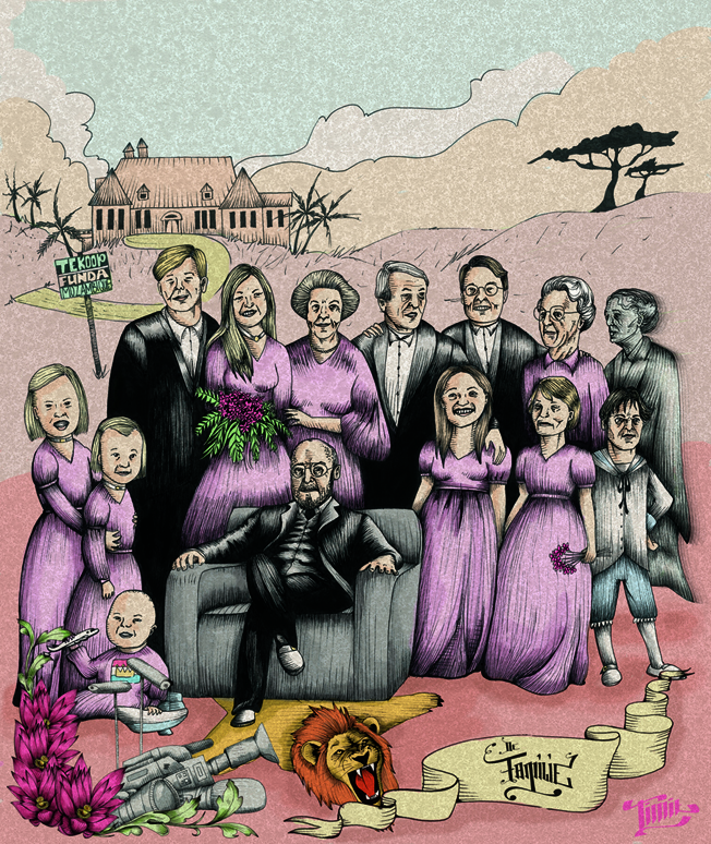
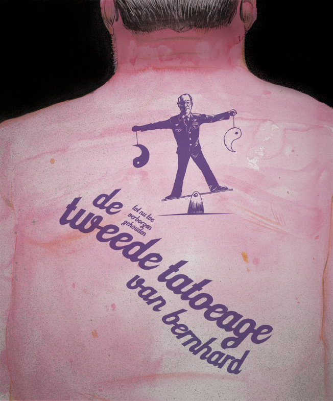
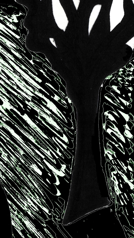
in this spirit, one of the best designs for the 2010 vpro cover i thought was the one below by teun van den wittenboer (if teun or vpro object, please let me know and i will remove the image, although it can be seen at the link above):

design teun van den wittenboer, VPRO Gids Cover 1, 2010

the text reads: "the -up 'till now hidden- second tattoo of bernhard".

you might wonder what i find so brilliant about this...but i think the image is perfectly executed, and i also consider the idea to be a brilliant mockery of what we dutch think of as important in life...the exterior body, and silly secrets. we do not take the time to ponder the real implications of our monarchy, instead we are fascinated by gossip-magazine items and glitter and glamour.

the jury -as expected somewhat i must say, since i have now seen more years of designs and jurying- did not spot this design, it seems. the winning design was -contrary to my expectations which were obviously too high- a very non-committal silhouette of our queen, nothing more. well, no controversy there, a very safe choice! but not really in concordance with the original commission if you ask me. and for me it also raises the question of how critical our television broadcasting associations really are. i hope we will not drift towards an italian situation, where television is largely mind-numbingly stupid entertainment.

we need critics! we need people who dare speak out against superficiality and money/power/sex as a sole goal in life. so i hope the vpro will continue to orient itself towards such a critical role.

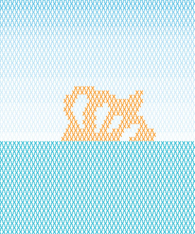
anyway, the jury did pick out the following design by michelle sipers, which i also think is very good (see the above remark about removing the image):

design michelle sipers, VPRO Gids Cover 1, 2010

i will perhaps pick out some more designs in the next post.

Monday, January 10, 2011

100,000 visits to this blog

well, not so much perhaps when compared to really well-visited sites, but surprising to me nonetheless! and i'm glad that what i put up here reaches a lot of people (although i get little feedback as to what they think of it ;-)), this is added motivation (although i would write for a few people just as well, but it does give the feeling that the (relatively new) internet really gives a new platform to people like me). thanx to all readers!

nuclear energy (vpro cover, digital design) continued

i would like to describe where the previous design came from (let me repeat it below for best reading, design for the january 2007 vpro cover, click on the image for a large enlargement)

v-pro of contra, design frank waaldijk, VPRO Gids Cover 1, 2007

some elements:

in 1982 in my final year in high school i made a cynical postcard `greetings from kalkar'. at the time there were plans for a nuclear plant in kalkar, and i was very much against. the card was meant as a cynical depiction of how a nuclear plant could (never) be a touristic feature...

however, strangely enough, the plans were ultimately cancelled, leaving the already constructed outer building with no clear purpose. in the nineties, this building was converted in a water-based attraction park for recreation, and called kernwasser wunderland, today the park is called wunderland kalkar...and what once was a cynical postcard now is simply touristic reality...incredible, isn't it?

greetings from kalkar, frank waaldijk 1982

cooling tower used as climbing wall in wunderland kalkar

you can see how i used elements from the postcard in the vpro design...

%%%%%%%

for dramatic effect, i also used a figure from a painting by rubens (but since a computer crash, i have been unable to refind the original painting from which this figure was taken...i've tried searching for it with google, but to no avail.

the direction of looking of the original figure was dramatically upward (far more so than in this design), i photoshopped until the face had the right expression. then i also added a radiation burn pattern on the face...because in my not so humble opinion we are taking an extremely unfair risk with regard to future generations.

detail rubens, vpro design frank waaldijk, 2007

&&&&&&&

in the background, the dramatic picture of the sun is actually a depiction of a much safer form of nuclear energy: fusion. both solar energy and possibly in the future nuclear energy from fusion are far more sustainable than our current nuclear plants imnsho.

in the foreground, i have tried to recreate the old photographic effect of solarisation (arising from overexposure of negatives in a certain way):

detail solarisation, vpro design frank waaldijk, 2007

&&&&&&&

to clarify the borssele connection, i added this element in the standard design of dutch town limits:

detail borssele, vpro design frank waaldijk, 2007

then of course the lettering: the commission always states to leave out the lettering and the vpro logo. but in this case i did not have much faith in the vpro's own layout, and also i wanted to sharpen the theme by adding `vpro or contra'.

*******

so, there you have the different layers of the design all spelled out...perhaps you can understand why i am still very contented with this design, perhaps not.

*******

to finish, another design which i thought was `cool'...;-) by judith van meeuwen [there were many other cool designs, unfortunately the vpro has removed the higher resolution pictures and this is the best i can offer; if judith or vpro object to my reproducing it here, please let me know and i will remove it]:

new energy, vpro design judith van meeuwen, 2007

it is a really mystifying, atmospheric design, which to me has all the intrigue of something we don't know about yet, and which is also clearly about energy.