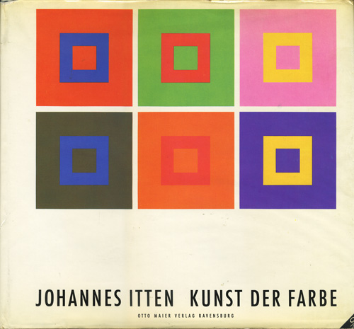
in this day and age we still have no reliable way to represent/reproduce colours.
and certainly not online. this fact to me is still less surprising than that nobody complains about this (have you ever heard someone else beside me complaining about this?).
take for example the famous painting luncheon of the boating party (le déjeuner des canotiers) by pierre-auguste renoir. let me present below the three first results from google image search:

le déjeuner des canotiers, pierre auguste renoir (1881, click on the image for an enlargement)
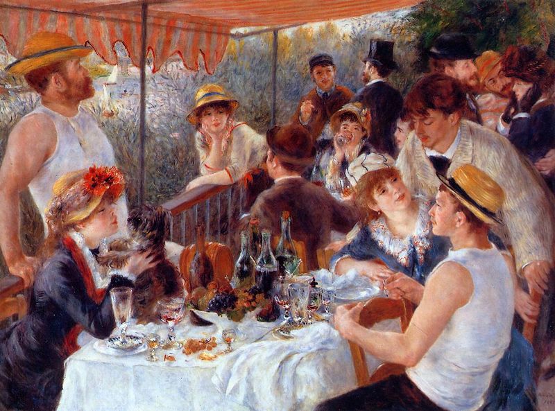
le déjeuner des canotiers, pierre auguste renoir (1881, click on the image for an enlargement)

le déjeuner des canotiers, pierre auguste renoir (1881, click on the image for an enlargement)
i could go with more reproductions of this painting...and each would be quite different from the other. so even when searching for art images, i am constantly evaluating picture size, detail but also overall colour. and this is hard, even if i have seen a painting many times in real life. and i have come to observe often that my own computer screen is very different from other screens, so i cannot in any way really control what you are seeing on your screen.
this to me is extremely frustrating, it is like having a piece of music being represented in different speeds, scales, instrumentations, on different computers... but (almost) nobody complains. this is a very clear indication that most people don't care about the precise colour of the things they're looking at. except when it's clothes, or cars, or ...
anyway, be sure that the pictures presented on this blog often involve a tedious amount of photoshopping. this holds especially for photographs of my own artwork. here i discover time and again that my canon 650d is simply not as good colourwise as my canon 350d was (before the batteries expired, new batteries are extremely expensive, i thought i would get better value from the much newer model 650d, but alas). as a result there are quite some paintings that i have not been able to photograph satisfactorily at all, even when using photoshop extensively. so i'm studying on how to resolve this. one way i have discovered is to use a combination of photoshop and picasa. admittedly i'm no expert on photographing, nor on photoshop. but in this series on extraneous work, it seems fitting to mention that i have been forced to acquire much more expertise in these disciplines than i would have liked to, simply to be able to present art.
of course in the pre-digital days, i simply could not afford the equipment which was necessary for good colour reproductions. so all my bitching aside, there is some improvement.